Slide 7.6: Demonstrations (cont.)
Slide 7.8: Demonstrations (cont.)
Home

|
Slide 7.6: Demonstrations (cont.) Slide 7.8: Demonstrations (cont.) Home |
|
| UI Element and Functionality | Example | Resource(s) |
| Alert—Displays a warning, error, or confirmation message. |

|
Alert (Talt)
|
Application icon—Icon to display in Launcher
|
|
Application icon ( tAIB)Application icon family ( taif)
|
| Bitmap—Displays a bitmap. | 
|
Form bitmap ( tFBM)Bitmap ( Tbmp)Bitmap family ( tbmf)
|
| Command button—Executes command. | 
|
Button ( tBTN)Graphic button ( tgbn)
|
| Check box—Toggle on or off | 
|
Checkbox ( tCBX)
|
| Form—Window that displays other UI objects |
|
|
| Gadget—Custom control | 
|
Gadget ( tGDT)
|
| Shift Indicator—Displays shift status. | 
|
Shift Indicator ( tGSI)
|
|
Label—Displays noneditable text. |

|
Label (tLBL)
|
|
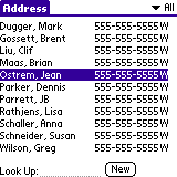
List—Displays a series of items. |
|
List (tLST)
|
| Menu—Executes commands. |
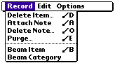
|
Menu Bar (MBAR)Menu (MENU) |
| Pop-up list—Chooses a setting from a list. |

|
Pop-up trigger ( tPUT)Pop-up list ( tPUL)List ( tLST)
|
| Push button—Selects a value. |

|
Push button ( tPBN)Graphic push button ( tgpb)
|
| Repeating button—Increment/decrement values or scroll |

|
Repeating button ( tREP)Graphic repeating button ( tgrb)
|
| Scroll bar—Scrolls fields or tables. |

|
Scroll bar (tSCL)
|
| Selector trigger—Invokes dialog that changes text of the control. |

|
Selector trigger (tSLT)
|
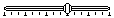
| Slider—Adjusts a setting. |
|
Slider (tsld)Feedback slider ( tslf)
|
| Table—Displays columns of data. |

|
Table (tTBL)
|
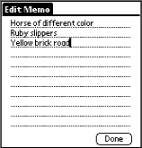
| Text field—Displays text (single or multiple lines). |

|
Field (tFLD)
|